Friday, November 21, 2014

Stop Motion Has Literally Stopped Motion

Hey guys, my class has been assigned a group assignment that is a stop motion project. I am working with three incredible animators to create our story. If you want to check out some other things going on with this project check out my partner and friend Kelsie Wilt.


We were inspired by the stop motion music video Morning Elegance that was all shot with the emphasis of stop motion. Our idea deals with a girl having a nightmare that is represented by black sheets that continue to try and capture her. The difficult part of this animations the song we were hoping to put the animation to is four minutes and thirty- five seconds, which would mean we would have to take over 5,000 pictures. We decided to cut the song to two minutes which meant we only needed to take around 1,000-2,500 pictures.


I am hoping to get this project all set up and ready by the middle of next week. Our biggest problem is not having the bed or sheets, we are trying to get some loaned to us, so we don't have to establish a budget that is looking like it would be around $90 for just the sheets. Hopefully we can get a king sheets set and king mattress ready for shooting next week. 


We worked a whole week on the storyboard and it was a hard and long process. 


We had to go through the music second by second and plan out every frame, thankfully most of Kelsie Wilts past projects have incorporated this in-depth storyboarding music sync. 


In the story, a girl is running from her nightmares and is given a sense of hope by a horse that comes to save her. We had done a few tests with the sheets to see what it would look like and it looked awesome! 
We were hoping to be finished around this week, but that did not happen. 
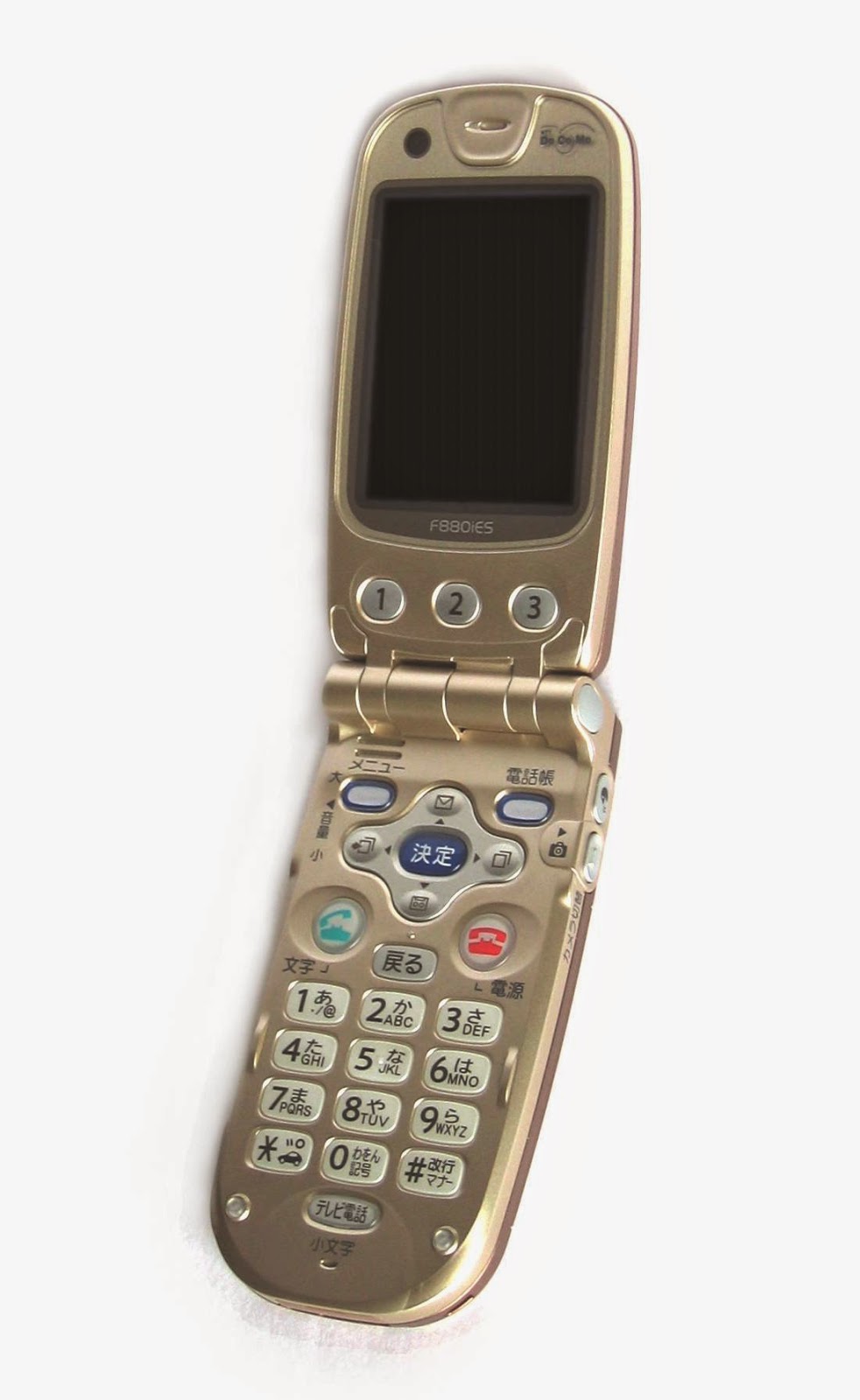


Our stop motion project had not worked out because of time and material issues. We began to think of a new idea with only two days left to work on the project, so we re-started our project with a new idea.


Our new idea is a text message coming out of a phone, but it comes our as a note instead of a normal "cyber" message. The first note says "You Matter" and it crawls around the school, and to our good friend Mike's phone. Then Mike sends another message the same way that says, "UR 2 LegiT 2 Quit" that goes back to our teacher, Mr. Netterville  and he was happy to receive it. 


Our pre-production process for our new idea started with the idea of spreading kindness throughout our school. We had two students suddenly pass away last week and I felt that kindness is the only way to help people recover during this hard time.


We also wanted to add a fun kind of twist to the end by incorporating our animation teacher receiving the text in the end of our project.

We story boarded in a day, and shot the project in two days. This made our group very stressed and very articulate with everything we did. We moved the note card very slow, which took us even longer to shoot.


On the way of making this project I learned that we need to have all the appropriate materials and time before starting the project. Over time, I felt that our group was honestly ready to rip each others hair out and we started to get on each others nerves, but we made it through.


For my next stop motion project, I will check what time I have until the project is due and get the materials collected before you get set on an idea. My biggest problem is that once I get a really good idea, I get my mind set on it, and I do not want to change my idea at all. I need to work on expanding my ideas and projects to make them more entertaining to not just me, but my audience.


Our team 


Kelsie Wilt was one of our two project managers. She helped come up with the original idea and the new idea. She also drew up all the storyboards. She is a hand drawn animator than a stop motion or 3D animator, but she brought a lot of skills to our team and our project.


Mike Webster was our technical director. He would move the card around the floor for us to shoot, he also helped convince Mr. Netterville to have us put note cards on him.


Hasset Habt was our behind the scenes. She helped add her own twists and ideas to our project. She really helped out during the post production process, but was not as involved in our production or post production


Chloe Kraus (This Blogger) was one of our two project managers and director of the project. She helped come up with the new and old project ideas. She also was the cinematographer for the project, and had to move notecards when they are at Mr. Netterville's desk.


New Project Has Some Progress

Hey guys,

My new project is slowly but surely getting started. My group for our stop motion project is almost done with our final project, click here to get the hyperlink to my blog for that project.

As I said in my last blog, the movie Interstellar was the inspiration for my next project. I had spent several hours earlier this week to storyboard my idea so I could see what my plan for this animation is. I am combining both my portrait and animation skills together for this project.


Here is the song I plan on using for the animation. It is from the original soundtrack, so I do not own any rights to the music.


 My storyboards are very different from other peoples storyboards. I do not like being confined to a small box. Even if that is the size of my frame, I like to be able to see the whole thing all together.

The first part is going to show the house and under it list the directors name, until dust blows the name away. The camera then moves up to the window and goes inside Murphy's room. It will be zoomed on the book shelf where the books will fall to spell "Written By Jonathan and Christopher Nolan". In the movie Murphy has a model of the moon landing rocket, I am going to have the camera zoom into the rocket and it will list the executive produce. The rocket will flip over and become a chemistry beaker to symbolize the labs they worked in, with the name of another producer bubbling out the top. The background going up will turn black, then show rockets shooting up with lines reading the others producers names, now this is where it gets really complicated; I will zoom up on the lines with producers names are, then rotate the lines, and inserting the other producers in the spaces between the bars. The next transition would be the one of the bars stretching out to make a part of the watch that the main character wears, then zoom in on the watch, which has a hand ticking a morse code message. I would zoom into the watch part, and when the hand moves down it will wipe the word, "Music By" on the top, then it will wipe the letters away and say the composers name. I will zoom out and the shape of the watch will make one of the engines of the space ship.


On page two it starts with the "Gigantic" planet they have to pass by that gets them into a different dimension. I will have different parts moving within to, then have the name of the editor flow through it. The next part would be a wave from the first planet they visited with the words "Casting By" then the wave comes crashing down and the casting persons name pops up from the water. It when then going into the vector portraits of each character. Some will shatter for a transition to another character.
***SPOILERS***
The final part is when the main character goes into the 5th dimension and it will show the way Christopher Nolan had illustrated on the scene. It will then transfer to Cooper's daughters life span, which is showed by the vector portraits from her being young to old, while Cooper's portraits state the same since the time he was in was slower than Earths time.


Here is the first vector portrait of Cooper I have done so far. It took me two days in class to complete, but it will all be worth it in the end. I will have to do eight portraits of just people, then over a dozen of just objects. I hope that this project will look good enough to enter into our state wide multi media festival. 

I will check back in a few weeks to show my project. 

Monday, November 17, 2014

Interstellar Idea!

Hey guys, 
This past week has been a long week. We unfortunately had two students pass away, so not a lot of work had been done through this tough time. My group was dealing with the problem of a fast approaching deadline, and lack of materials. We have had to scrap our whole idea (which seems to be a normal thing with me) and come up with a shorter simpler idea. Our idea is a kind text being sent, but instead of digitally the text jumps out of the phone as a piece of paper and runs through the class room to the other person. The test render looks very good, so the final should be done by Friday.


Now you're probably wondering why the title to this blog is Intersellar idea. My dad and I got to go see the new Christopher Nolan movie Interstellar starring Matthew Mcconaughey and Anne Hathaway,  last night. 


I was inspired by some of the fan art I found online today, 


(Source: Pintrest I do not own any of these pictures.)

and began storyboarding a credits animation, that goes with some of the music to the movie. It will look similar to my past Supernatural animation that was not finished. I hope to get this project started tomorrow. 

Thursday, November 6, 2014

STOP... COLLABORATE AND MOTION

Hey guys, it has been a while since blogged about my animation class. We are now doing a group assignment that is a stop motion project. I am working with three incredible animators to create our story. If you want to check out some other things going on with this project check out my partner and friend Kelsie Wilt.


We were inspired by the stop motion music video Morning Elegance that was all shot with the emphasis of stop motion. Our idea deals with a girl having a nightmare that is represented by black sheets that continue to try and capture her. The difficult part of this animations the song we were hoping to put the animation to is four minutes and thirty- five seconds, which would mean we would have to take over 5,000 pictures. We decided to cut the song to two minutes which meant we only needed to take around 1,000-2,500 pictures.


I am hoping to get this project all set up and ready by the middle of next week. Our biggest problem is not having the bed or sheets, we are trying to get some loaned to us, so we don't have to establish a budget that is looking like it would be around $90 for just the sheets. Hopefully we can get a king sheets set and king mattress ready for shooting next week. 


We worked a whole week on the storyboard and it was a hard and long process. 


We had to go through the music second by second and plan out every frame, thankfully most of Kelsie Wilts past projects have incorporated this in-depth storyboarding music sync. 


In the story, a girl is running from her nightmares and is given a sense of hope by a horse that comes to save her. We had done a few tests with the sheets to see what it would look like and it looked awesome! 
I'm hoping to start this project this upcoming week,
and hopefully be finished by the end of November, then 
have post production for about a week. 


Friday, September 26, 2014

And thats a... FLOP

Well, our video to promote our program flopped. The deadline was really early and the video portion of the project was not put together how we envisioned it. We went in and had another meeting with the video department to see what we could do to re-shoot and come up with some new ideas to make the video better and more about our project. We are currently brainstorming and meeting again in about two weeks to share our ideas. The big thing with this project is to to have everyone on board. Both the video and animation teachers need to be fully supporting our idea for the collaboration to work between the two strands (focus groups)


So since I had been working at school and at home with the ideas of the cubes, I did not really have time to finish my previous tutorial driven project, so for my final project I will be using one of my test renders for the cube.
I hope to have better news in two weeks!

Friday, September 19, 2014

A Bigger Project Instead

Hey guys, it's been a while since I was last on. The last time I blogged, I was in the middle of a "tutorial" to do the smoke FX from the show Supernatural. I have had to pause that project for a big school project in which all of the Video, Animation, Graphic Design and Web students all come together to collaborate on one project. The project is a promotional video advertising for our program. The central theme is to share ideas and become creative as a whole program. To represent ideas, we are using cubes that continue to pop up above peoples heads as ideas are shared.


The collaboration part of this project has been a bigger challenge than what I had anticipated on. The video group wanted the video to have the animated cubes being passed in peoples hands, like handing someone an idea. With a time frame of two weeks, that idea seemed impossible. We met up three more times that week to see how we could make it manageable for us animators. That is when the cube coming above the head came into play.


Some video people disagreed with the idea, saying it looked too much like the Sims games and that, it wouldn't look good. My teacher and I got a sample clip after the meeting and showed the cube being tossed back and forth, it took us about two hours just to animate  the cube being tossed between two people. This obviously meant that the change of the position and actions of the cube above the head were are only option. 
We will be getting the footage on Monday and begin working our magic! 


Tuesday, September 9, 2014

This is Harder Than I Thought

Hello all, it's me again. I have made a daring endeavor by try to combine a couple tutorials together for my first project, as I talked about in my previous blog. The effect I am trying to recreate is a "demon" (smoke form) going inside a person, as seen below.


Now this effect is actually harder than it seems. I have looked into  exact tutorial on this effect, but most of them are not crisp and clear as I would want them to be. I then looked at Andrew Kramer's site for Video Copilot. I found a flying smoke similar to the effect in the example video above. I attempted to format the Video Copilot tutorial to the project I was doing, but unfortunately it did not work as I wanted it to.

This is where I will be coming into the career of animation strong. In major animation careers, they do not get to watch tutorials to figure out how to do their entire project, they have to mess with the settings, lighting and sound all on their own and with their own knowledge with the program and animation.

(Top: Andrew Kramer,
Bottom: Original PIXAR Team )


At this point I am actually only about a class period behind schedule, and at the same time I am still ahead on the project, it's just creating the effects without anything to look off of is difficult. A big problem I have been having though is having the smoke get darker. I have played with the color for about three days now and it just won't balance out to be the dark black/gray color. I hope to get this figured out by late this week, early next week.


Here is the final render of the demon possession video FX I did. the entire animation was not complete, but I still understand all of the content and can use it towards other projects i the future.

Friday, August 29, 2014

Well That Idea Didn't Work

As my last blog said, I was planning on doing a frame by frame full length animation. I looked at all of the work I would need to do, and I am seeing it as almost impossible to finish at the due date October 1st. I had it storyboarded and ready to start, so I will most likely keep the project and do it at a later time. I have decided to dive into more special effects, since I have not gotten into special effects as much as 3D or 2D stories and modeling. I will be doing three tutorials put into  one major effect in a video. There will be a scene shot, and will be finished fully animated and crisp. Here is my time line for this project.


SPECIAL EFFECTS PROJECT


AUGUST 29- GET ALL FOOTAGE FROM VIDEO DEPARTMENT SHOT AND EDITED
BLOG: THE TEST RENDER OF THE VIDEO EDITED TOGETHER. TALK ABOUT HOW TO ADJUST THE EFFECTS SINCE THEY ARE BEING COMBINED


SEPTEMBER 3RD- BEGIN ADDING THE SOUL SUCKING EFFECT ONTO THE VIDEO 
(3 DAYS)
BLOG: THE DIFFICULTIES OF THE EFFECT AND HOW YOU FEEL COMBINING THE EFFECTS TOGETHER.


SEPTEMBER 8TH- ADD SMOKE EFFECTS ARE ADDED TO THE SOUL SUCKING EFFECT
(4 DAYS)
BLOG: THE DIFFICULTIES AND EITHER SUCCESS OR FAILURE TO ADD SMOKE


SEPTEMBER 15TH- ADD BLACK EYE EFFECT (1-2 DAYS) 

SEPTEMBER 16TH- BEGIN POLISHING THE PROJECT EFFECTS MAKING SURE THEY LINE UP CORRECTLY WITH THE FOOTAGE. (1 DAY)
BLOG: THE FINAL RENDER OF THE EFFECTS ON THE SCENES AND THE DIFFICULTIES THE PROJECT HAD YOU FACE.  


SEPTEMBER 17TH- BEGIN THE "ANGEL" WING PROJECT, EXPLORE TUTORIALS AND EFFECTS (3 DAYS)
BLOG: YOUR INITIAL IDEA WITH THE WINGS AND WHY THIS WILL BE A HARDER PROJECT 

Monday, August 25, 2014

First Animation Project of Senior Year


Hello all, I am back! I am beginning to put together an animation for my animation class that will probably be my biggest animation yet! I am doing my animation to the song Welcome Home By the Radical Flares. I am thinking of doing a "life cycle" of a boy and a girl starting off as little kids and grow up and having kids. I will be doing two projects in one, first will be stop motion of what I want to put into the animation itself, since my drawing skills aren't up to par yet. I will then trace anything I want to see into Photoshop and put it together frame by frame. I am still storyboarding and brainstorming, but here is my beginning outline of the project. 


                  Welcome Home Animation


August 26th- Start Storyboarding
Blog: Storyboard and plan of how this project will get done
August 27th- Finish storyboarding, begin getting pictures taken
Blog: Post the pictures and the difficulties having siblings pose and other factors.
August 27- 29th- Get the photos taken and put together.
Blog: The photo sequence put together into an after effects project.
August 29th- finish getting pictures taken, begin fancy tracing
Blog: The difficulties of the fancy tracing and how it will be resolved
September 2nd- GONE FOR GOLF
September 3rd – October 1st- Continue fancy tracing and finish first part of the project. (I know this is a wide space, but I will be making a new outline once my project is “finalized” and I know exactly what I’m doing)
Blog: The project difficulties up to this point, how you feel the rest of the project is going and what you could have done better. 

Monday, August 11, 2014

Busy Summer, but Ready to Get Back to It

It has been a while since I have gotten on my blog to update you guys on my work over the summer. I am a golfer and am captain on the girls golf team at school this year, which means I had to work my butt off this summer to be the best at my game. I have been traveling around the country playing in tournaments, which means less time at my computer to work on projects. School starts in four days, so I need to be ready to get back in the groove of things.

GISHWHES PROJECT
In my last blog I had mentioned an event called GISHWHES (The Greatest International Scavenger Hunt the World Has Ever Seen), that I had participated in and had created the color scheme for. One of the 185 challenges was to create a sci fi movie poster including the actor/ man in charge of this event, Misha Collins and the Queen of England.  Using my creative skills, and two night of my life (while playing in tournaments during the day), I created a masterpiece shown below. 


The most time consuming part of  this poster was Misha's shirt. I painted each square/ tile shown in the picture I was going off of. Just the squares took me around five hours and the rest of his body took me around two hours to complete. His oldest son West (bottom left) took me around three hours to complete, and had some modifications for the painting. In the original photo I was going off of, West was pictured holding a bra. I had to paint his hands into a different potion than where they were in the original picture and make the bra in the original photo look like a blanket in the final piece. Misha's daughter Maison (bottom right) only took me around two hours to complete, because frankly I was just really tired and did not go into as much detail with her as I should have, which was a little bit of a disappointment to me.

The hardest part for me was how to put them all together, I am not a graphic designer, and I do not know how to equal out spaces in photos or drawings very well. It wasn't until 2:35 AM Thursday morning that I had finally gotten it, and it had turned out way better than I had expected.

POSTERS FOR CLIENTS

Today, I went into my Papa's (Grandpa's) optical shop, and noticed some really cool Ray Ban sunglasses posters/ads. I asked him if he would want me to make him one to display in the store, and of course he said yes.


These are some of the examples of the posters that inspired me to do this.


I started off of what I think of when I see Ray Bans, and frankly I think of the movie The Outsiders by S.E. Hinton, old milk shake diners, greesers and Elvis, so pretty much anything between the years of 1950's-1960's. Though I enjoy classic styles and music from those eras, I also had to think, what about the people who enjoy or know the 21st century better than the 1950's and 60's.


The two images that I went off of for this poster was a 1958 Ray Ban advertisement and a 2013 Ray Ban advertisement.

One of the difficult parts of this project was lining up the two faces to somewhat match. The glasses on the right were also difficult to draw because they did not have a definite shape in the original image, I had to re draw them over ten times.

I honestly thought the 1958 model would be hard to paint because of the black and white coloring of the original image, but I now realize that even in black and white images, there are many shades of color, not just black and white.

I am not a graphic designer, nor do I want to be one, but doing these paintings is not a job to me, it is more of a relaxer. I love to sit and draw on my computer for hours at a time with my classic rock playing, just because it helps get my mind off of all the other stuff in my life. It also puts my life, feelings and creativity on
a page for others to see.


 When school starts, animation will be a big focus for me, and trying to decide what type of animation
is right for me. College is coming up in a year, and I still haven't made up my mind of where I want to
go, but I know animation will be my career and life.

Thursday, June 12, 2014

Summer Projects

Hey guys, I'm back (sort of). I have been out of school for what seems like a millennia, but has only been three weeks. I have been doing a lot of "pen painted" Photoshop portraits the past few weeks.

All of these took me around a day to do. The Captain America one actually took me about a week because of the time and detail I put into his jacket and shield. The portrait of the three kids took me 13 hours straight to finish because of all the different skin tones. It was really fun and I enjoy being able to make the photographs look more in-depth and interesting.

 Below is a portrait of actor Misha Collins I did. It took me around four hours to finish this portrait. Misha has an international scavenger hunt called GISHWHES (The Greatest International Scavenger Hunt the World Has Ever Seen). Every year they have a mixture of two animals as the mascot, it is time again this year to create one. He is looking for a person to design a new mascot and logo. I have been working on this for a few days now and I like the out come.


Below is the original 2013 logo with the famous "Wooster" mascot (Wolf and Rooster). Below that one is the logo I created called the "Moobit"(Moose and Rabbit). It took me around two hours just to recreate the poster, then another hour to insert the Moobit I drew. Everyone wish me luck that my logo and mascot is chosen!!!

Thursday, May 15, 2014

The End of Junior Year

Hello, I'm back. Its been awhile since I last blogged. I began a new project in late march after my teacher had shown me some of the animations by Saul Bass. I watched a lot of his works over a period of a week to get used to his style, so my project would look in sync and not have styles all over the place like my previous project.

I really liked the hand drawn and shape aspects he brought to his animations and openers since it gives each part of the animation a different look, but yet it all goes together nicely in the project. 


At the time, the AMC show the Walking Dead was entering its season finale, so I thought it would be a good idea to do an opener for the show in Saul Bass' style, since it gives it a eery and hand drawn feeling. It is rough on the edges such as the show makes the viewers get on the edge of their seats.  


It took me about two weeks to make the entire project. Each image was made with the vertex tool in Photoshop. Red was  the color of choice in this piece, which gave each character/ actor a different perspective. 


I also used the original Hitchcock font that Saul Bass used in most of his creations, so it would tie the piece in nicely. I used the Walking Dead font for the title because it was the shows original font used in the opener. 


This project was a smaller project since I had just finished my three month long project that received fourth place at the eMagine Media Festival. I felt that I needed to keep working, but also needed to take a little break and actually get out of school at 3:00 instead of 8:00 or 9:00. 


Here is the final product. (Chad is my Step dad btw.) 


I started my next project in the beginning of April when I began watching the show Supernatural. I was going to do an opener for the show in both my style and Saul Bass' style mixed together, so it didn't seem like I was stealing his style. The portraits for the show took me about three weeks just to make, since I was creating them from individual vertexes. For all the portraits, I used only black and white mixed colors, so that it all fit together and the colors would pop from the red background. 

The license plate was really fun to make because, living in Kansas you never really pay attention to how much detail had been put into our license plates. It was fun to make it in a more cartoon style, but still having it being sophisticated. I also love the color of blue I used in the background of the license plate, because   it made it pop and catch the eyes of the people viewing it. 
Sam's (on the right) portrait was one of the easiest, and yes he is a he. A lot of people thought that the portrait made him look like a woman, I honestly thought it looked like a young  Sigourney Weaver (Alien, Ghostbusters, Avatar.) By removing a mole and some of the depth in his face, he looks less "girly". This portrait only took me around an hour to draw. 
Dean (on the left) was the hardest portrait because the actor that plays his character (Jensen Ackles) had no "straight forward" pictures. I did Deans portrait around five times until I finally decided to use this one (top). Dean's portraits took me around two weeks to make perfect and choose which one I wanted to use. 


Castiel (Right) was another hard portrait to do because none of the pictures cut off the top of his head or would not show his body. He is my favorite character, so I wanted to make him look really good. His portrait took me around three hours to make it 100% perfect. 


John (left) was my final human portrait for this project. He was very hard to draw with vertexes because of the different volumes in his hair, since his hair in the photo I was going off of was black, I had to add the gray . His teeth were also very difficult. His hair took me an hour and a half to do and his face took me an hour to do. 


The 1967 Chevy Impala is the "icon" of this show, so I knew I had to include it in the project. The tires were the hardest part of this part because the tires should be completely round, but vertexes make that very difficult.  It took me around two hours to draw the car. In my project, it is never fully animated because the work caught up to me and I could not do it. 


This is my favorite drawing that I did. It is the front of the Impala and is currently hanging in my car collecting grandpa's basement. This was the most detailed drawing I did for the animation, even the Chevrolet logo was done with individual vertexes in a separate layer and shrunk down to give it better authenticity. This drawing took me around three hours to get it to its best quality. 


Two weeks after the portraits were done, I tried putting them into the opener sequence I had planned out, but I honestly hated the way the project was looking and stopped. It is my first unfinished work in this class, and I hope for it to be my last. 


My final project for the year is a Kinetic typography of different scenes from the show Supernatural. I have worked on this project for about a month, and it's been a really fun project. I think the hardest part of this project was just putting all the quotes together in a smooth functioning way. There aren't very many screen shots I could take for this one, so I am just going to put the render of what I have so far below. 


This year has been by far my most successful year in animation, I have chosen animation to become my future career and life style. I hope to do more projects over the summer, and will blog them. Thanks so much!